


If you’re trying to figure out how to hook website users’ attention, it helps to be brutally honest about what you’re up against.
Your visitor isn’t sitting down with coffee to “read your site.” They’re usually on their phone, in pain, half-distracted, comparing 2 to 5 clinics, and trying to answer one question: “Is this the place that can help me?”
And they decide fast.
Researchers have shown people can form an initial impression of a website’s visual appeal in as little as 50 milliseconds. That is not a lot of time to communicate clarity, credibility, and the next step.
So if your website is set up like a digital brochure, the kind that slowly introduces who you are, what you believe, and where you’re located, you’re losing the attention game before it even starts.
This article is designed to help you build an attention-grabbing website that still feels clinically trustworthy. These hooks are not gimmicks. They are the same behavioral principles used in high-performing healthcare websites, applied in a way that respects patients and improves conversion.
The 3-Second Window: In 2026, You Don’t Have Minutes, You Have Seconds

The “3-second rule” is not a motivational slogan; it’s an online behavior reality.
Google’s published data shows 53% of mobile visits are abandoned if a page takes longer than 3 seconds to load. Even if your clinical care is excellent, a slow site can prevent people from ever experiencing it.
So when clinics ask why ads “aren’t working” or why SEO traffic “isn’t converting,” the answer is often not the ad copy. It’s that the user never stays long enough to be persuaded.
The “Stickiness” Factor: Getting Traffic Is Only Half the Battle
SEO and ads are for acquiring visitors. Your website is for converting them.
If your visitor bounces, you paid for that click, or you spent months earning that ranking, and got nothing back. Worse, your analytics may show “traffic is up,” while your schedule stays flat.
A sticky PT website does three things quickly:
- It makes the visitor feel understood
- It makes the clinic feel credible
- It makes the next step feel easy
The ten hooks below are built to deliver those outcomes.
The Framework: From Digital Brochure to Attention-Grabbing Website That Converts
Before we get tactical, here is the lens that ties everything together:
- Attention is earned by relevance and clarity.
- Trust is earned by proof and transparency.
- Action happens when friction is removed.
When a website fails, it is usually failing one of those three.
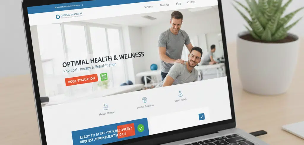
1. Use a “Hero” Headline That Solves a Problem
The hook
Do not lead with “Welcome to [Clinic Name].” Lead with the result the patient wants.
Your hero headline is not branding space. It’s your first conversion lever.
Why it works
Patients in pain are scanning for an identity match. They want to know: “Is this for someone like me?” That’s an identity trigger.
A headline like “Personalized Physical Therapy” is too broad. It forces the visitor to do mental work to figure out if you are relevant.
What to do instead
Write your hero headline like this:
Outcome + condition + identity context, without medical jargon.
Example comparisons:
Better: “Get Back to Running Without Knee Pain”
Weaker: “Quality Physical Therapy Since 1998”
Better: “Stop Sciatica Flare-Ups and Move Confidently Again”
Weaker: “Helping Patients Live Their Best Lives”
Clinics often fear “narrow headlines” because they treat one headline as if it must represent every service. In practice, the hero area is about grabbing attention, not summarizing your whole clinic. You can support broader services below.
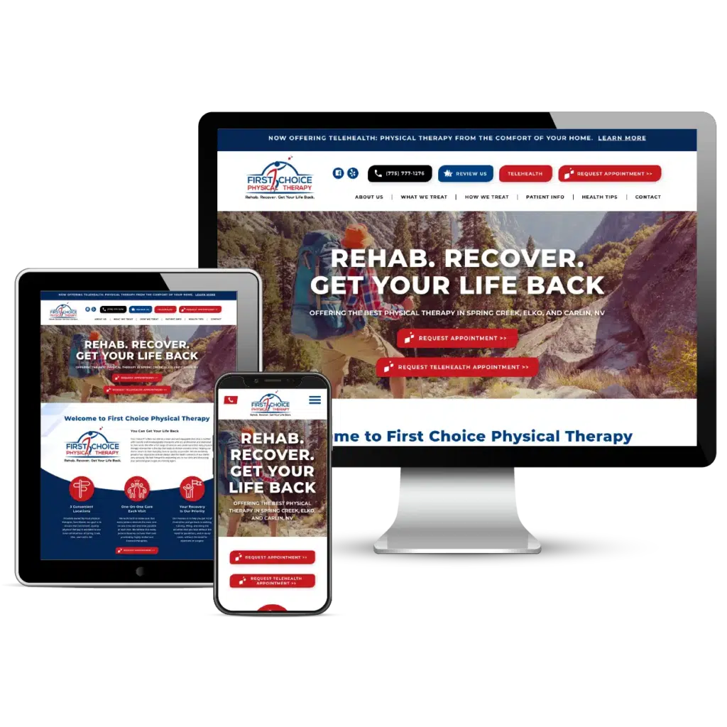
2. Implement the “F-Pattern” Visual Hierarchy
People scan websites in an “F” pattern. Put the most important information along that scan path.
Nielsen Norman Group’s eye-tracking research identified the F-shaped scanning pattern, and later confirmed it still holds even as devices and behaviors have evolved.
What this means for PT websites
Most PT sites bury key conversion elements in places users do not scan first. Common mistakes include:
- Phone number only in the footer
- “Request Appointment” hidden under “Contact”
- Too many navigation items competing for attention
- Important trust indicators buried mid-page
What to do instead
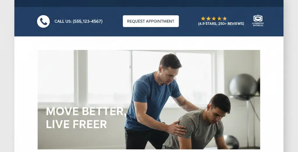
Your top-of-page layout should make three things unmissable:
- Primary action (book, request appointment, free screening)
- Phone number (click-to-call on mobile)
- Trust signal (rating, review count, affiliation, credential snapshot)
When clinics redesign, they often focus on aesthetics and forget scanning behavior. Visual hierarchy is not decoration; it is attention control.
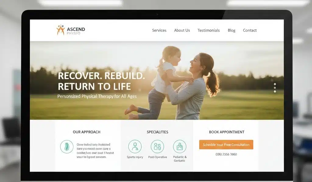
3. Feature “Result-Oriented” Imagery
Avoid pain photos. Show success photos.
Why it works
People don’t just buy services; they buy the future version of themselves. That’s especially true in PT.
Result-oriented imagery does something that text alone struggles to do: it helps someone picture their recovery.
What to show
Your imagery should show “life after PT,” not “pain during injury.” Examples:
- Parent lifting a child
- Older adult climbing stairs
- Athlete training again
- Worker moving confidently
This is not about unrealistic promises. It’s about a realistic visual goal. The image says, “This is the kind of outcome we help people work toward.”
One last thing. Stock photos do not automatically harm conversion, but irrelevant stock photos do. If your images feel generic, they erode trust. If your images feel specific to the life your patients want, they earn attention instead.
4. The “One-Button” Rule (Dominant CTA)
Too many choices create analysis paralysis.
This isn’t opinion, it’s backed by research on choice overload. In a well-known study by Iyengar and Lepper, people exposed to more choice were less likely to take action, even though more choice seemed appealing.
What this looks like on PT websites
Many clinic sites overload the first screen with multiple competing actions:
- Book online
- Call now
- Download guide
- Chat
- Subscribe
- Insurance verification
- “Learn more” buttons everywhere
This creates friction for someone who is already mentally overloaded by pain and uncertainty.
What to do instead
Pick ONE primary action and make it dominant sitewide.
Common best-fit CTA choices for PT clinics:
- “Request Appointment”
- “Book Evaluation”
- “Free Discovery Call”
Then make everything else visually secondary.
CTA optimization is rarely about “better words.” It’s about commitment to one path and consistency across the site. A visitor should never wonder what you want them to do.
5. Use Social Proof as a “Trust Hook”
People trust other patients more than they trust your About page.
Reviews are not just reputation management. They are a conversion mechanism.
Research from Northwestern’s Spiegel Research Center found that displaying reviews can significantly increase conversion rates, especially for higher-priced purchases, because reviews reduce perceived risk.

What to do on a PT site
Do not isolate reviews on a single page. Place proof near decision points:
- Under the hero section
- Next to the primary CTA
- On condition and service pages, matched to that condition
Example: if someone is on your sciatica page, they should see a sciatica or back pain success story, not a generic “friendly staff” review.
A common clinic mistake is showing only perfect reviews. Patients trust balanced, specific feedback more. Specific outcomes (“I could sleep again,” “I ran my first 5K”) are far more persuasive than vague praise.
6. Clearly Map the “3-Step” Patient Journey
Uncertainty creates friction.
When patients do not understand what happens next, they hesitate. That hesitation often looks like “I’ll come back later,” and later never happens.

Alt text: A smiling woman sitting on a couch, holding a smartphone in both hands while researching physical therapy clinics.
What to do
Build a three-step pathway that makes the process feel safe and predictable:
Step 1: Talk to a therapist (discovery call or evaluation request)
Step 2: Get a plan (assessment + clear next steps)
Step 3: Return to function (goal-based milestones)
This works because it reduces ambiguity and makes the outcome path feel achievable.
If you offer direct access, emphasize it here. If you require referrals in some cases, explain that simply. Clarity earns trust.
7. Address the “Insurance Elephant” Early
The unspoken question is: “Will this cost me a fortune?”
Cost uncertainty is a major reason people bounce.
Even if you cannot quote exact prices for every case, you can reduce financial anxiety with transparency.
What to include
This section should be short, visible, and calm. Options that reduce friction:
- “We accept most major insurance plans.”
- “Not sure about coverage? Call, and we’ll check benefits with you.”
- “Prefer to start with clarity? Book a free 10 to 15-minute discovery call.”
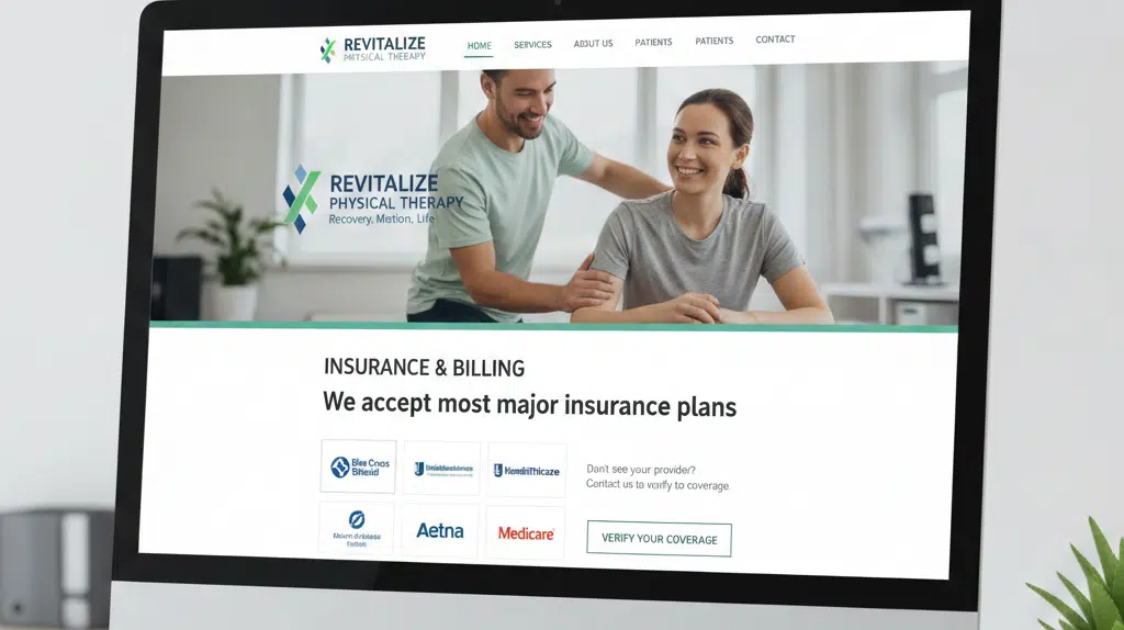
Clinics often avoid financial language because they worry it will “turn people off.” In practice, avoiding it turns off the people who need reassurance most.
8. Create a “Curiosity Gap” with Educational Content
Curiosity keeps people scrolling.
A curiosity gap is when you hint at an answer but require engagement to get it. Done ethically, it’s powerful in healthcare because it frames you as the expert before the patient ever meets you.
Examples:
- “The 3 reasons your back pain keeps coming back”
- “Why stretching isn’t fixing your shoulder”
- “What most people get wrong about sciatica”

What to publish
You don’t need a massive blog. You need a small set of high-intent topics that align with what you treat most and what people actually search.
Educational content is your “trust builder.” It keeps visitors on site longer and makes booking feel like the obvious next step.
The clinics that win locally often have the same pattern: a few strong condition pages plus a handful of genuinely helpful articles. It signals expertise and reduces “shopping around.”
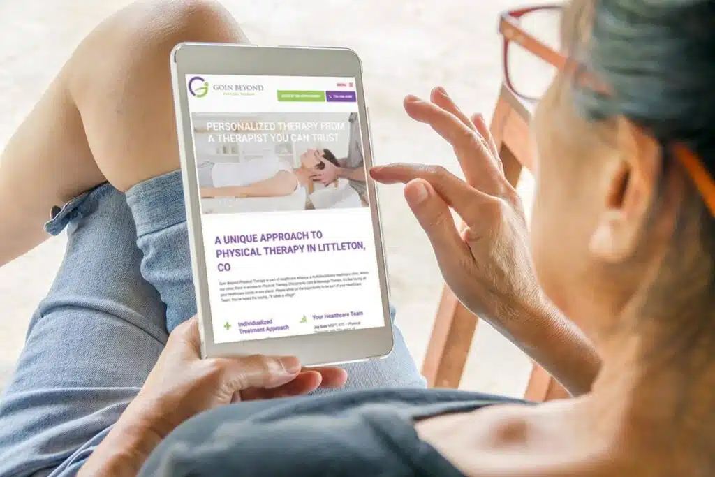
9. Optimize for the “Mobile-First” Majority
Mobile is not just a design preference. It is how Google evaluates your site.
Google’s Search Central documentation explains mobile-first indexing, which means Google primarily uses the mobile version of your content for indexing and ranking.
So if your mobile site is slower, thinner, or harder to use than desktop, you are not only losing patients, you may be losing rankings too.

Speed matters, a lot
Revisiting the speed data: Google’s published stats show large increases in bounce risk as load time increases, and 53% abandonment beyond 3 seconds on mobile.
Mobile optimization is not only about responsiveness. It’s click-to-call, thumb-friendly forms, and speed. A clinic can have a beautiful design and still lose because the page takes too long to become usable.
10. Leverage a Robust FAQ Section
FAQs reduce objections before the patient asks.
FAQs help attention and conversion because they prevent the visitor from leaving to find answers elsewhere. They also help SEO by matching long-tail questions.
Good FAQs address:
- cost and insurance
- pain and safety
- what the first visit looks like
- timeline expectations
- referral requirements

FAQs should not be generic. The best ones sound like they came from your front desk, not a template. That tone makes the clinic feel real and trustworthy.
A Practical Implementation Table: Hook, Psychology, What to Measure
| Hook | Core psychological principle | What to measure in GA4 / heatmaps |
| Hero headline | Identity trigger, relevance | Bounce rate, scroll depth, CTA clicks above the fold |
| F-pattern hierarchy | Scan behavior, cognitive ease | Click maps, time to first interaction |
| Result imagery | Future-self visualization | Engagement time, conversion rate on landing pages |
| One-button CTA | Choice reduction | CTA click-through rate, form start rate |
| Social proof | Risk reduction, credibility | CTA clicks after reviews, assisted conversions |
| 3-step journey | Uncertainty reduction | Form completion rate, call clicks |
| Insurance reassurance | Barrier lowering | Contact clicks on pages with insurance module |
| Educational curiosity | Authority building | Pages per session, return visits |
| Mobile-first UX | Friction removal | Mobile conversion rate, mobile bounce rate |
| Robust FAQs | Objection handling | FAQ engagement, SEO long-tail traffic growth |
Conclusion: Making Your Practice the “Obvious Choice”
A great hook doesn’t trick people. It gives them a reason to stay.
If you want an attention-grabbing website that converts for PT, the winning formula is consistent:
- Make relevance immediate
- Make trust visible
- Make action easy
You can have the best clinicians in town and still lose patients online if your website does not communicate clarity in the first few seconds.
If your website is not working as hard as your therapists, it is time to upgrade it.
Want a conversion-focused PT website review?
Book a Strategy Call, and we’ll walk through what’s holding your website back, what to fix first, and how to turn more visits into booked appointments.